


seerealbox
Revamped the Explore Tab to streamline content discovery
TIMELINE
Feb 2024 - May 2024
TOOLS
Figma
DISCIPLINE
Product Design
UX Architecture
Product Thinking
TEAM
1 Product Designer
2 Engineers
ROLE
As Lead Product Designer, I drove this 0→1 project, from strategy to design handoff, collaborating closely with engineers on technical constraints.
WHAT IS SEEREALBOX?
Seerealbox is a social media app that revives authentic connections, content, and meaningful interactions in an age where social media often lacks authenticity.
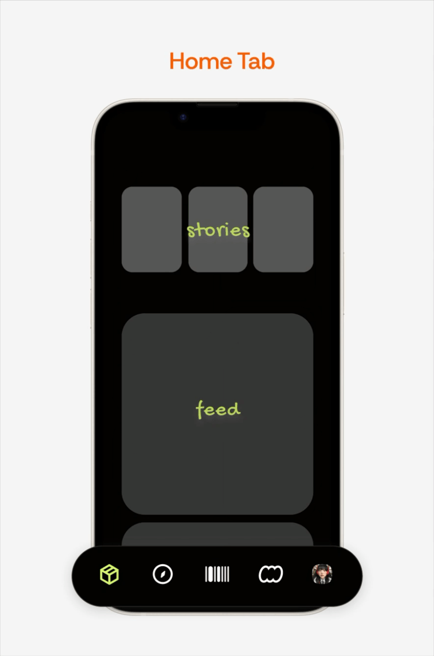
Overview
I redesigned seerealbox’s Explore Tab to unify browsing across five content types, helping users discover more relevant content with less friction.
Context
Most users rely on the Explore Tab for quick content browsing. However, it only showcases two out of five distinct content types, limiting users from discovering content efficiently.
Problem
Content is scattered across the app, with no centralized place for seamless browsing.
Solution
An Explore Tab that consolidates content types for easy content discovery and browsing.
Problem
There are five distinct content types on seerealbox, including images, videos, text, and polls.
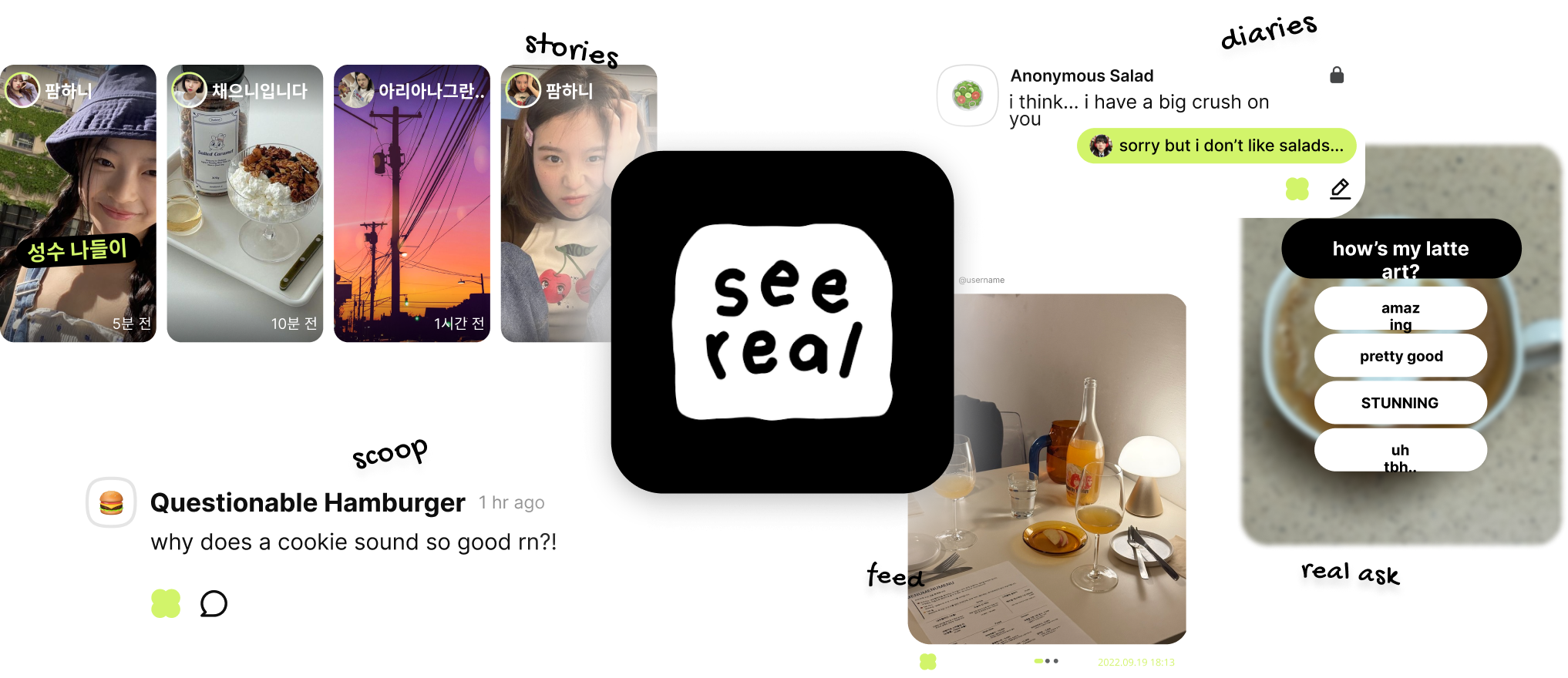
Content is scattered across the app, with no centralized method for seamless browsing.
User Pain
Users struggled to discover diverse content types because the Explore Tab was limited and fragmented.
Product Pain
Without a centralized discovery experience, users wasted time hunting for content and were more likely to disengage.
Business Impact
Poor exploration leads to reduced session time and less content interaction — critical metrics for social platforms.
DESIGN CHALLENGE
How might we create a centralized, intuitive Explore experience that lets users effortlessly discover, browse, and engage with diverse content?
SOLUTION
Turning the Explore Tab into a space for easy content discovery and browsing.
BEFORE
1 type of content throughout the Explore Tab


ariana
이상하다 분명...

9:41

What real are you searching for?
#grwm
#realchallenge
#nomakeup
#dog
realask


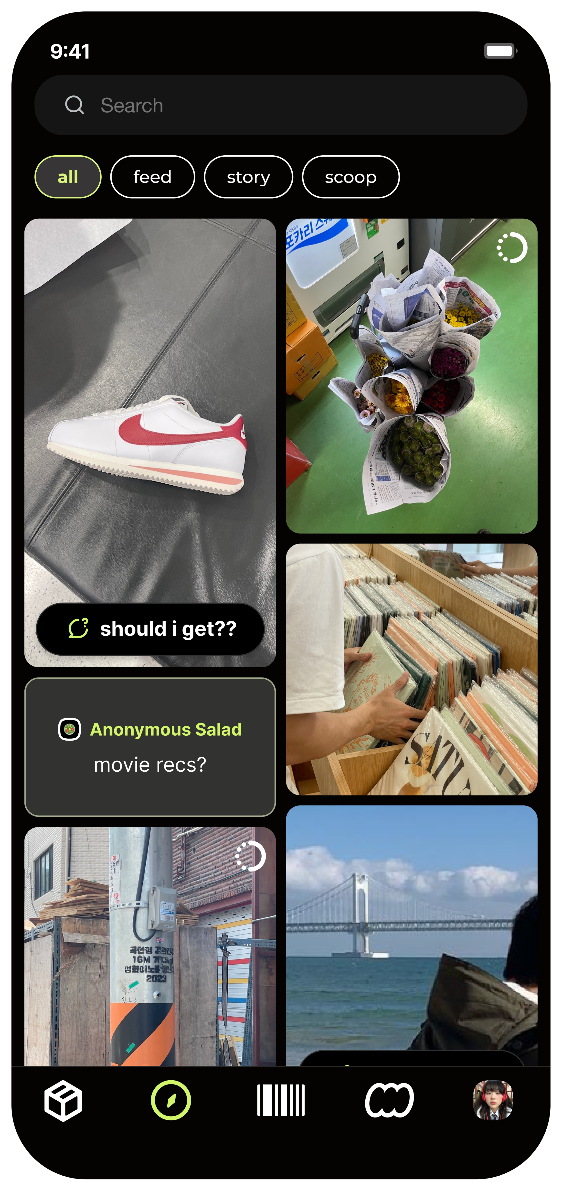
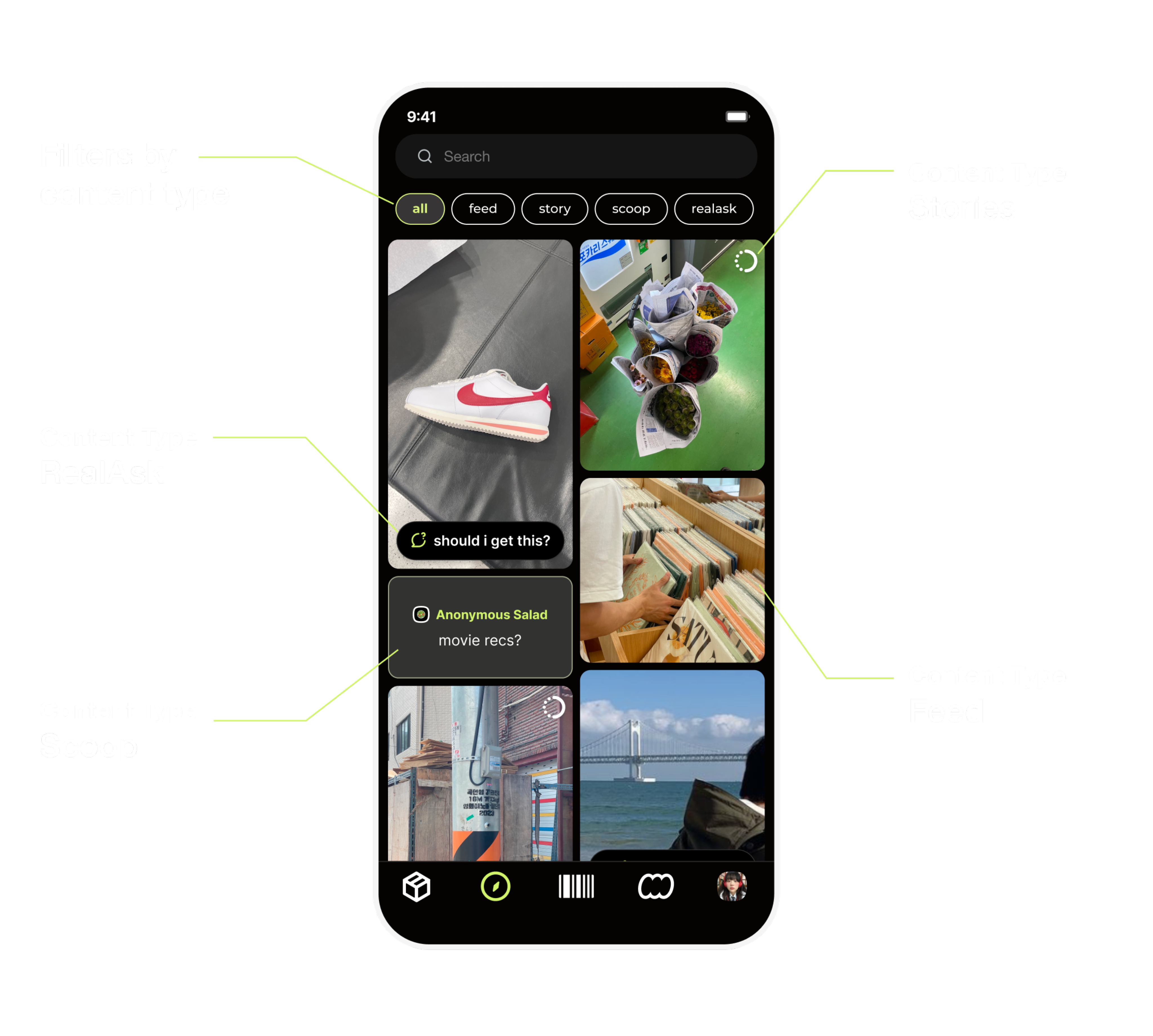
AFTER
5 different types of content scattered across the Explore Tab

realask example

scoop
scoop text


where am i??
ariana
이상하다 분명...
9:41
What real are you searching for?
all
feed
story
scoop
realask
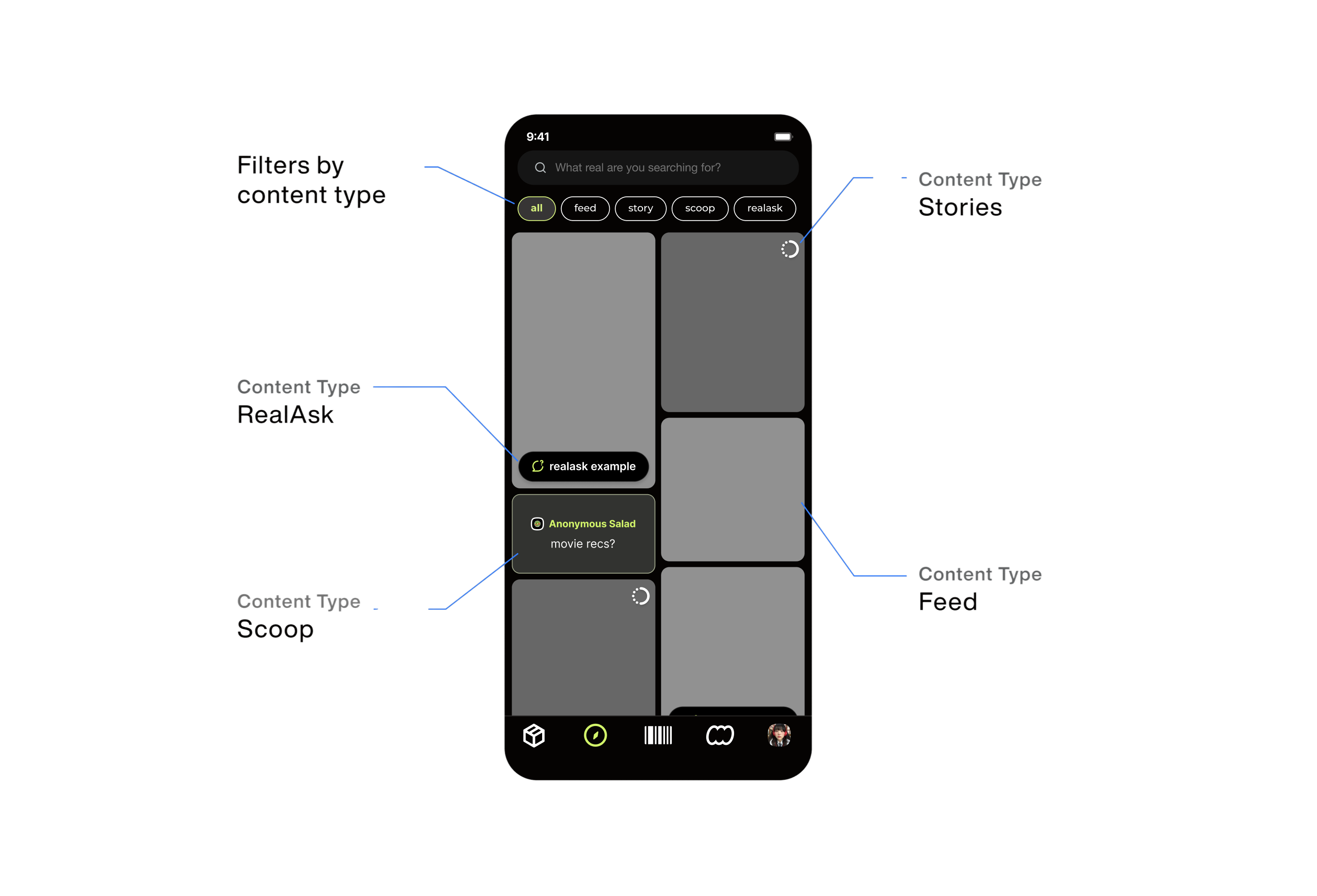
On the Explore tab, visual cues such as distinct components and icons were introduced to help users easily differentiate between content types.Tab buttons allowed users to quickly filter the page and access the content most relevant to them.
Design Process
User Research
Through a survey of 50+ users on the seerealbox app, I learned that:
Users primarily use the Explore tab for quick browsing and discovery, favoring a glanceable experience over deep dives.
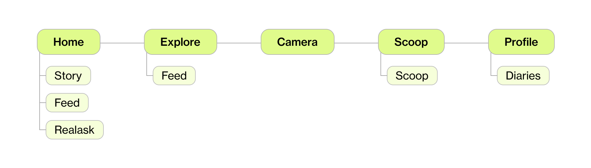
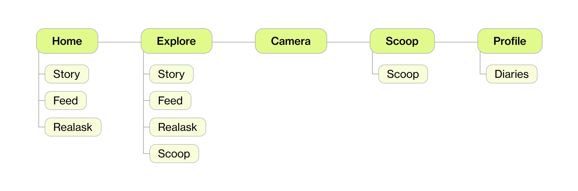
UX Architecture
To assess the current app’s information architecture and reorganize it effectively, I first mapped out its existing structure.
Then, considering the types of content users may want to access, I restructured the architecture accordingly.

Design Explorations
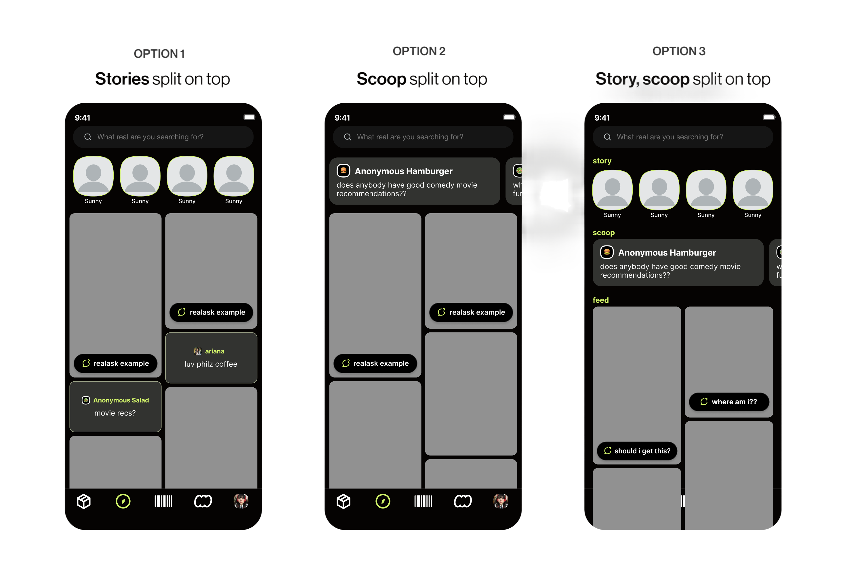
Concept #1: Clearly split the content types
What I tried: Clear separation of each content type into distinct modules.Pros: Clear identification of content types.Cons: Felt disjointed; reduced seamless feed experience.
CHOSEN DESIGN
Concept #2: Scatter the content types
What I tried: Mixed content types with visual icons + filter bar.Pros: Blended a unified scroll with clarity on what type of content is shown.Cons: Required careful hierarchy to avoid visual clutter.
Reflection
What I Learned
Designing Lean for MVPs
In a fast-moving startup environment, I learned to design efficiently—creating polished, user-friendly MVPs without extensive research or testing. It sharpened my ability to prioritize what matters most and deliver impact within real-world constraints.

Thinking Beyond the Interface
Working end-to-end, I considered user flows, technical feasibility, and business needs—contributing not just visuals, but product decisions that moved the project forward.
Next Project
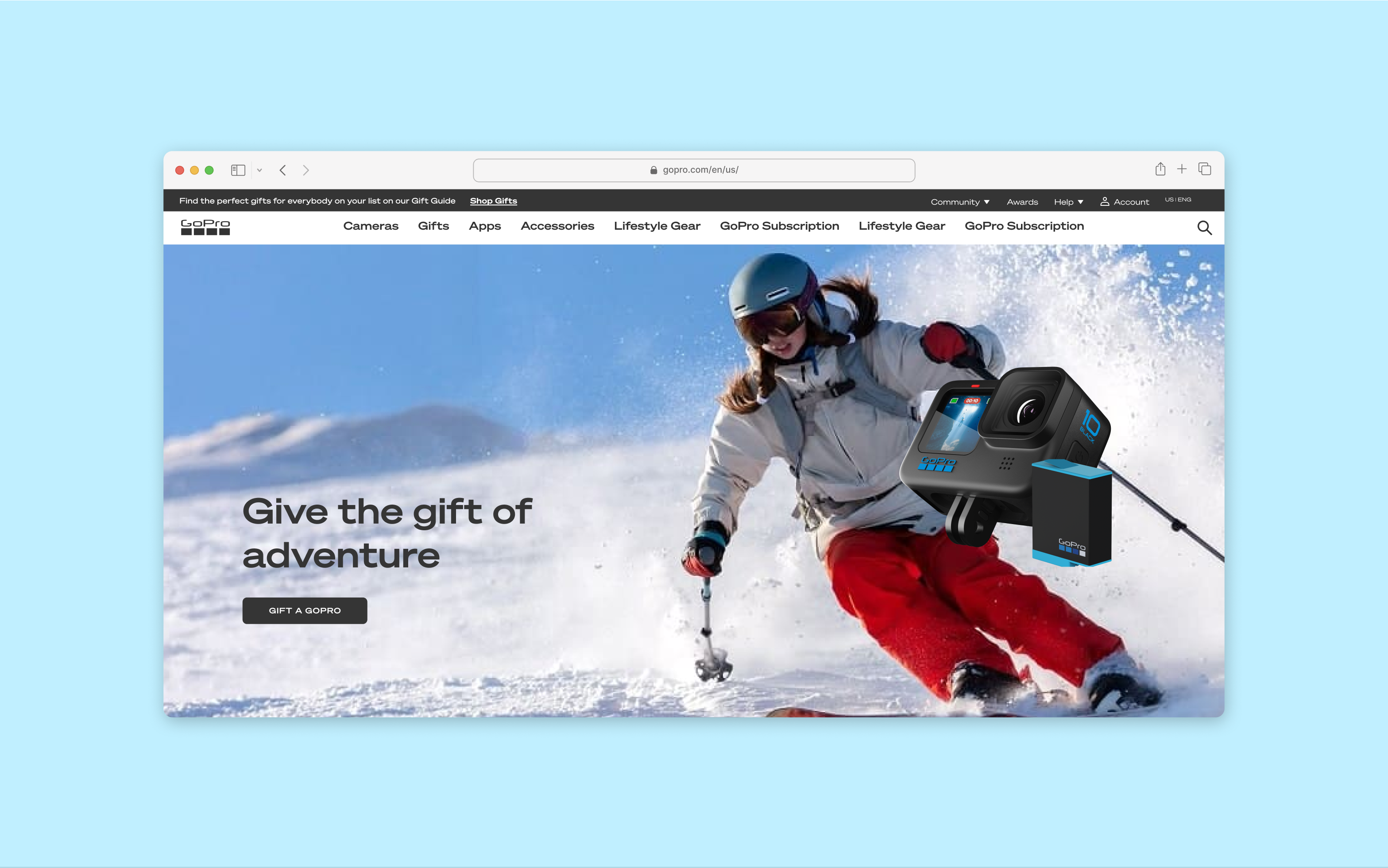
GoPro
Integrating a seamless online gifting experience for holidays

seerealbox
Revamped the Explore Tab to streamline content discovery
TIMELINE
Feb 2024 - May 2024
TEAM
1 Product Designer
2 Engineers
DISCIPLINE
Product Design
UX Architecture
Product Thinking
TOOLS
Figma
ROLE
As Lead Product Designer, I drove this 0→1 project, from strategy to design handoff, collaborating closely with engineers on technical constraints.
WHAT IS SEEREALBOX?
Seerealbox is a social media app that revives authentic connections, content, and meaningful interactions in an age where social media often lacks authenticity.
Overview
I redesigned seerealbox’s Explore Tab to unify browsing across five content types, helping users discover more relevant content with less friction.
Context
Most users rely on the Explore Tab for quick content browsing. However, it only showcases two out of five distinct content types, limiting users from discovering content efficiently.
Problem
Content is scattered across the app, with no centralized place for seamless browsing.
Solution
An Explore Tab that consolidates content types for easy content discovery and browsing.
Problem
There are five distinct content types on seerealbox, including images, videos, text, and polls.
Content is scattered across the app, with no centralized method for seamless browsing.
User Pain
Users struggled to discover diverse content types because the Explore Tab was limited and fragmented.
Product Pain
Without a centralized discovery experience, users wasted time hunting for content and were more likely to disengage.
Business Impact
Poor exploration leads to reduced session time and less content interaction — critical metrics for social platforms.
DESIGN CHALLENGE
How might we create a centralized, intuitive Explore experience that lets users effortlessly discover, browse, and engage with diverse content?
SOLUTION
Turning the Explore Tab into a space for easy content discovery and browsing.
BEFORE
1 type of content throughout the Explore Tab
ariana
이상하다 분명...
9:41
What real are you searching for?
#grwm
#realchallenge
#nomakeup
#dog
realask
AFTER
5 different types of content scattered across the Explore Tab
realask example
scoop
scoop text
where am i??
ariana
이상하다 분명...
9:41
What real are you searching for?
all
feed
story
scoop
realask
On the Explore tab, visual cues such as distinct components and icons were introduced to help users easily differentiate between content types.Tab buttons allowed users to quickly filter the page and access the content most relevant to them.
Design Process
User Research
Through a survey of 50+ users on the seerealbox app, I learned that:
Users primarily use the Explore tab for quick browsing and discovery, favoring a glanceable experience over deep dives.
UX Architecture
To assess the current app’s information architecture and reorganize it effectively, I first mapped out its existing structure.
Then, considering the types of content users may want to access, I restructured the architecture accordingly.

Design Explorations
Concept #1: Split Content Types
What I tried: Clear separation of each content type into distinct modules.Pros: Clear identification of content types.Cons: Felt disjointed; reduced seamless feed experience.
CHOSEN DESIGN
Concept #2: Scattered + Icon-Driven with Filters
What I tried: Mixed content types with visual icons + filter bar.Pros: Blended a unified scroll with clarity on what type of content is shown.Cons: Required careful hierarchy to avoid visual clutter.
Reflection
What I Learned
Designing Lean for MVPs
In a fast-moving startup environment, I learned to design efficiently—creating polished, user-friendly MVPs without extensive research or testing. It sharpened my ability to prioritize what matters most and deliver impact within real-world constraints.
Thinking Beyond the Interface
Working end-to-end, I considered user flows, technical feasibility, and business needs—contributing not just visuals, but product decisions that moved the project forward.
Next Project
GoPro
Integrating a seamless online gifting experience for holidays

seerealbox
Revamped the Explore Tab to streamline content discovery
TIMELINE
Feb 2024 - May 2024
TEAM
1 Product Designer
2 Engineers
DISCIPLINE
Product Design
UX Architecture
Product Thinking
TOOLS
Figma
ROLE
As Lead Product Designer, I drove this 0→1 project, from strategy to design handoff, collaborating closely with engineers on technical constraints.
WHAT IS SEEREALBOX?
Seerealbox is a social media app that revives authentic connections, content, and meaningful interactions in an age where social media often lacks authenticity.
Overview
I redesigned seerealbox’s Explore Tab to unify browsing across five content types, helping users discover more relevant content with less friction.
Context
Most users rely on the Explore Tab for quick content browsing. However, it only showcased two of the five distinct content types — limiting discovery and exploration.
Problem
Content is scattered across the app, with no centralized place for seamless browsing.
Solution
An Explore Tab that consolidates content types for easy content discovery and browsing.
Problem
There are five distinct content types on seerealbox, including images, videos, text, and polls.
Content is scattered across the app, with no centralized method for seamless browsing.

User Pain
Users struggled to discover diverse content types because the Explore Tab was limited and fragmented.
Product Pain
Without a centralized discovery experience, users wasted time hunting for content and were more likely to disengage.
Business Impact
Poor exploration leads to reduced session time and less content interaction.
DESIGN CHALLENGE
How might we create a centralized, intuitive Explore experience that lets users effortlessly discover, browse, and engage with diverse content?
SOLUTION
Turning the Explore Tab into a space for easy content discovery and browsing.
BEFORE
1 type of content throughout the Explore Tab
ariana
이상하다 분명...
9:41
What real are you searching for?
#grwm
#realchallenge
#nomakeup
#dog
realask
AFTER
5 different types of content scattered across the Explore Tab
realask example
scoop
scoop text
where am i??
ariana
이상하다 분명...
9:41
What real are you searching for?
all
feed
story
scoop
realask
On the Explore tab, visual cues such as distinct components and icons were introduced to help users easily differentiate between content types.Tab buttons allowed users to quickly filter the page and access the content most relevant to them.
Design Process
User Research
Through a survey of 50+ users on the seerealbox app, I learned that:
Users primarily use the Explore tab for quick browsing and discovery, favoring a glanceable experience over deep dives.
UX Architecture
To assess the current app’s information architecture and reorganize it effectively, I first mapped out its existing structure.
Then, considering the types of content users may want to access, I restructured the architecture accordingly.

Design Explorations
Concept #1: Split Content Types
What I tried: Clear separation of each content type into distinct modules.Pros: Clear identification of content types.Cons: Felt disjointed; reduced seamless feed experience.
CHOSEN DESIGN
Concept #2: Scattered + Icon-Driven with Filters
What I tried: Mixed content types with visual icons + filter bar.Pros: Blended a unified scroll with clarity on what type of content is shown.Cons: Required careful hierarchy to avoid visual clutter.
Reflection
What I Learned
Designing Lean for MVPs
In a fast-moving startup environment, I learned to design efficiently—creating polished, user-friendly MVPs without extensive research or testing. It sharpened my ability to prioritize what matters most and deliver impact within real-world constraints.
Thinking Beyond the Interface
Working end-to-end, I considered user flows, technical feasibility, and business needs—contributing not just visuals, but product decisions that moved the project forward.
Next Project
GoPro
Integrating a seamless online gifting experience for holidays