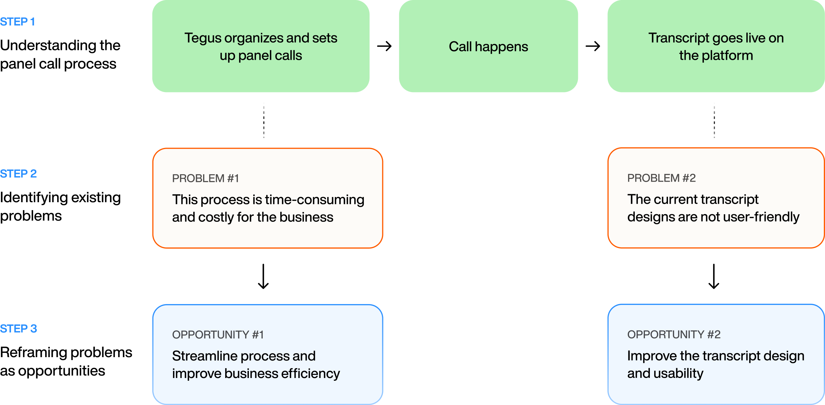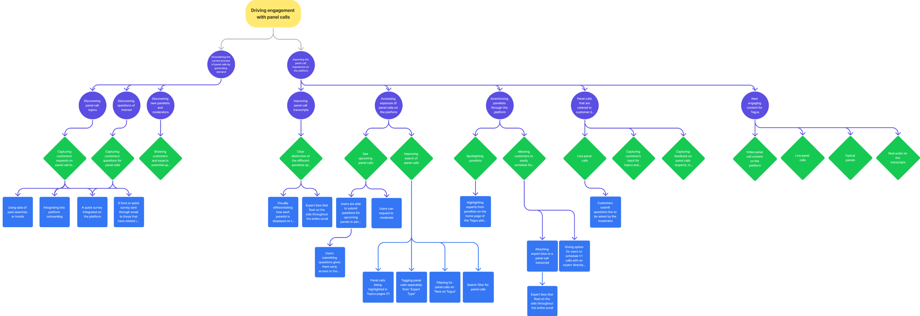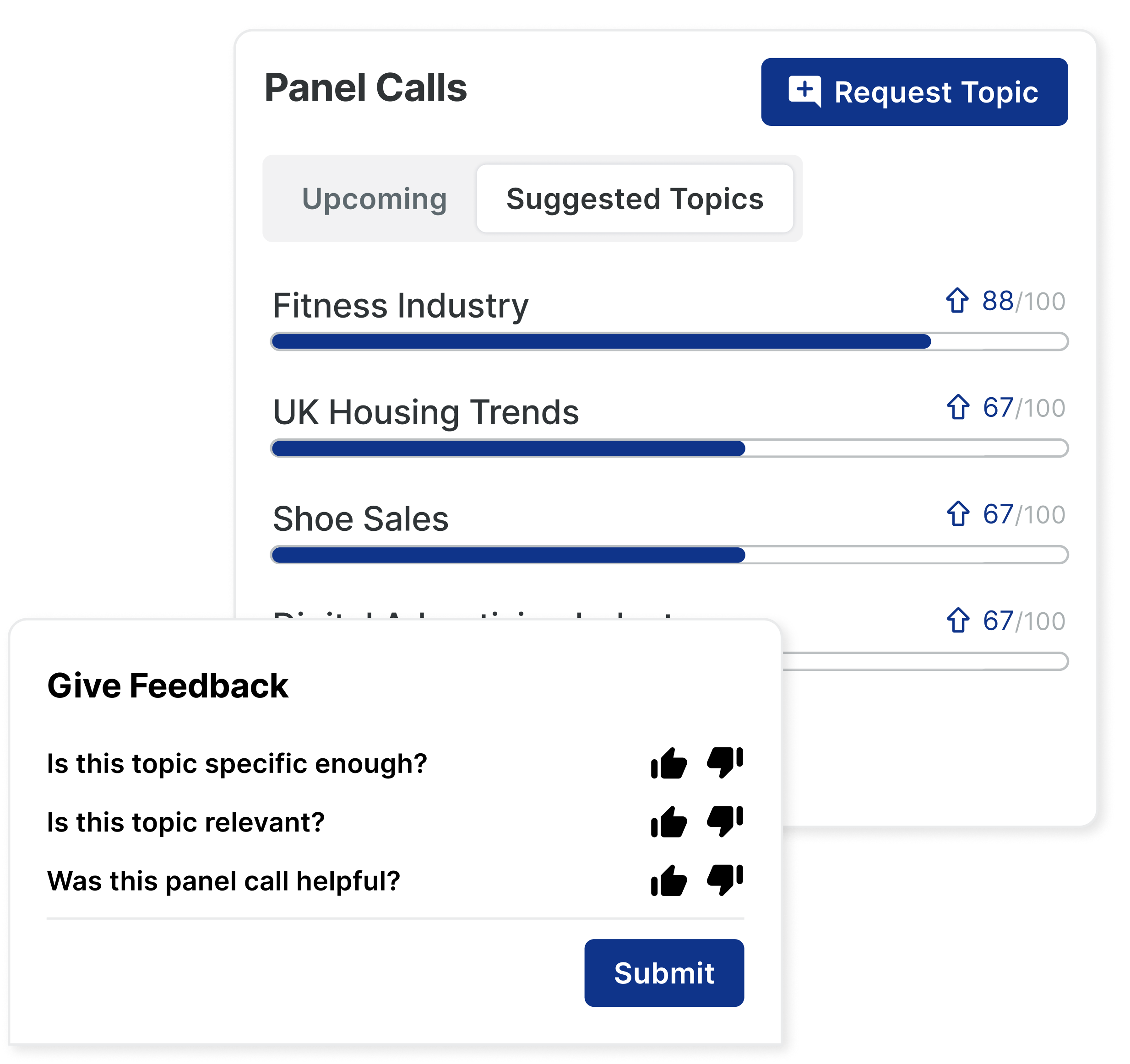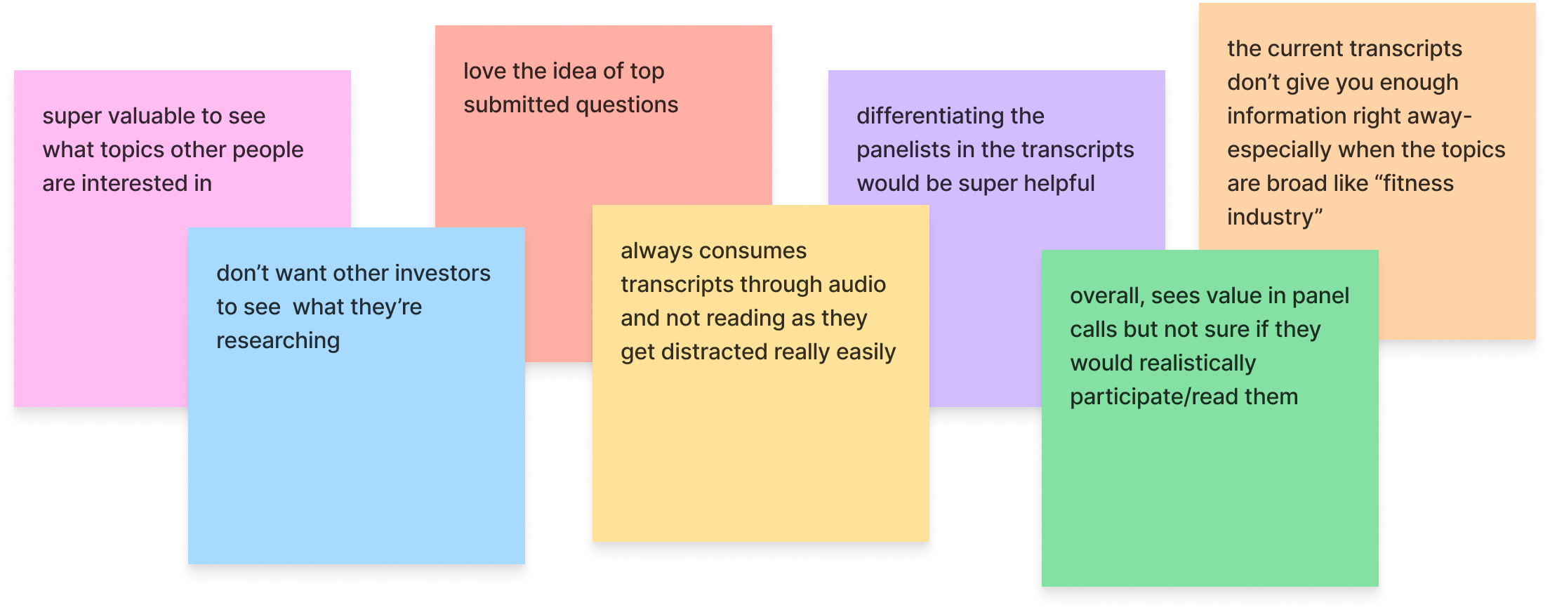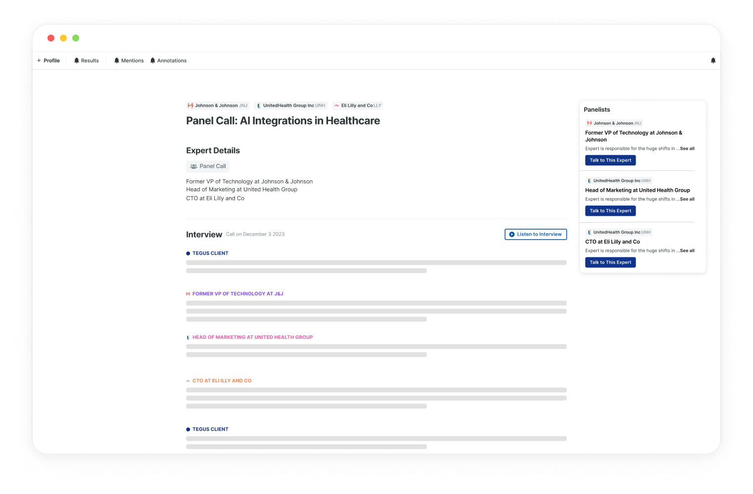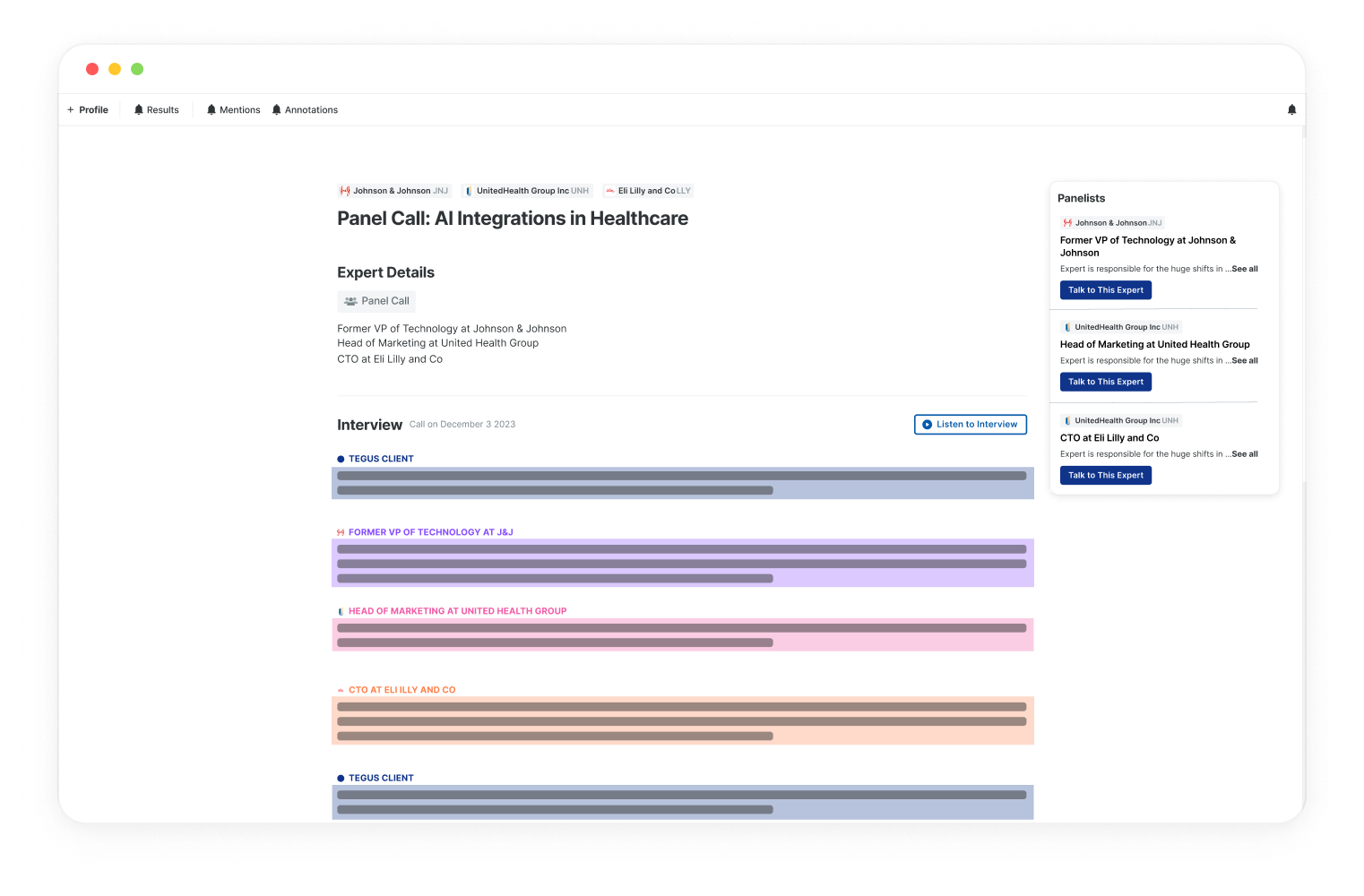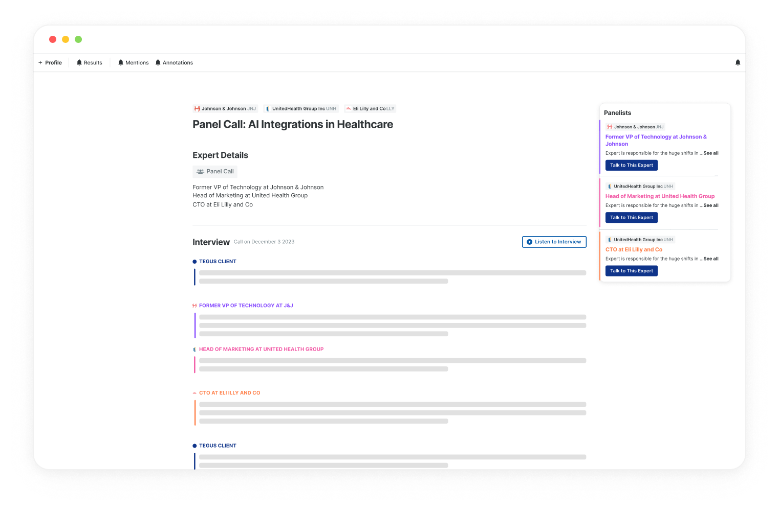
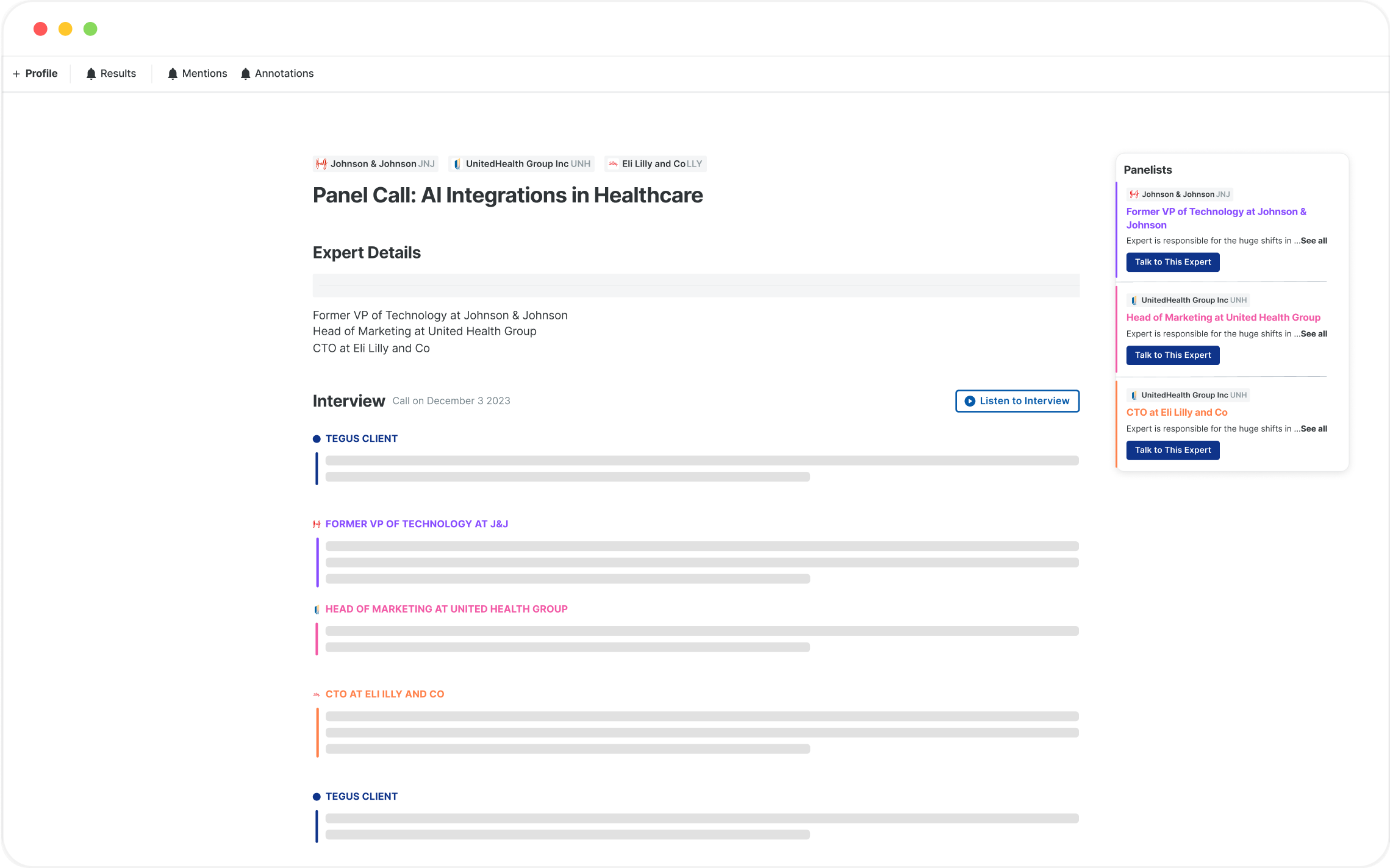

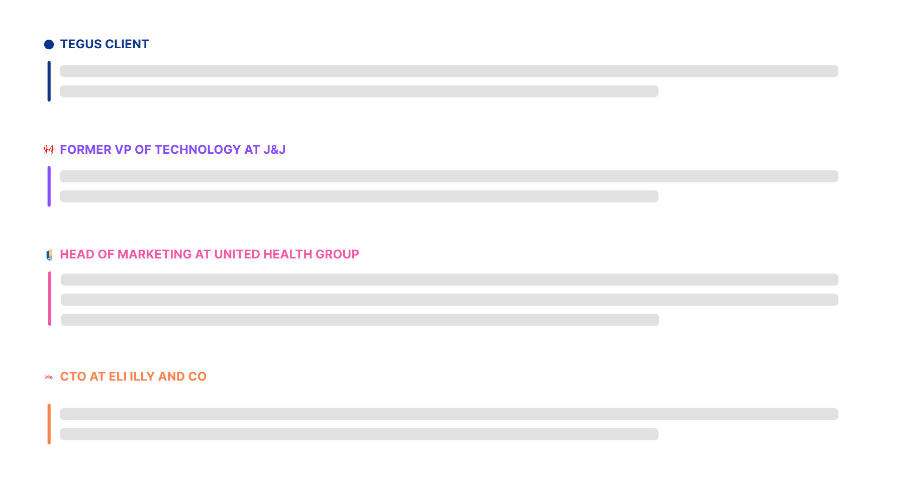
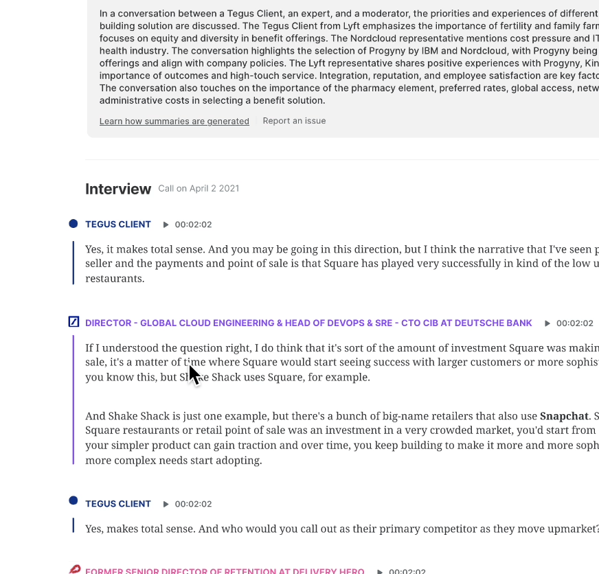

Identifying Opportunities
What areas of panel calls can be improved?
I began by talking to internal teams and reading customer feedback, to get up to speed about current challenges and rooms for improvement within Panel Calls and then identified ways to turn these problems into opportunities.