

Tegus: Dark Mode
Designed a dark mode theme with scalable design systems
TIMELINE
July 2023
TOOLS
Figma
DISCIPLINE
Product Design
Visual Design
Design Systems
TEAM
2 Product Designers
3 Engineers
ROLE
As a Product Design Intern at Tegus, I collaborated with another intern to guide this project from concept to handoff while overseeing its development.
WHAT IS TEGUS?
Tegus is a research platform that provides investors with insights through expert interviews and transcripts.
Overview
Context
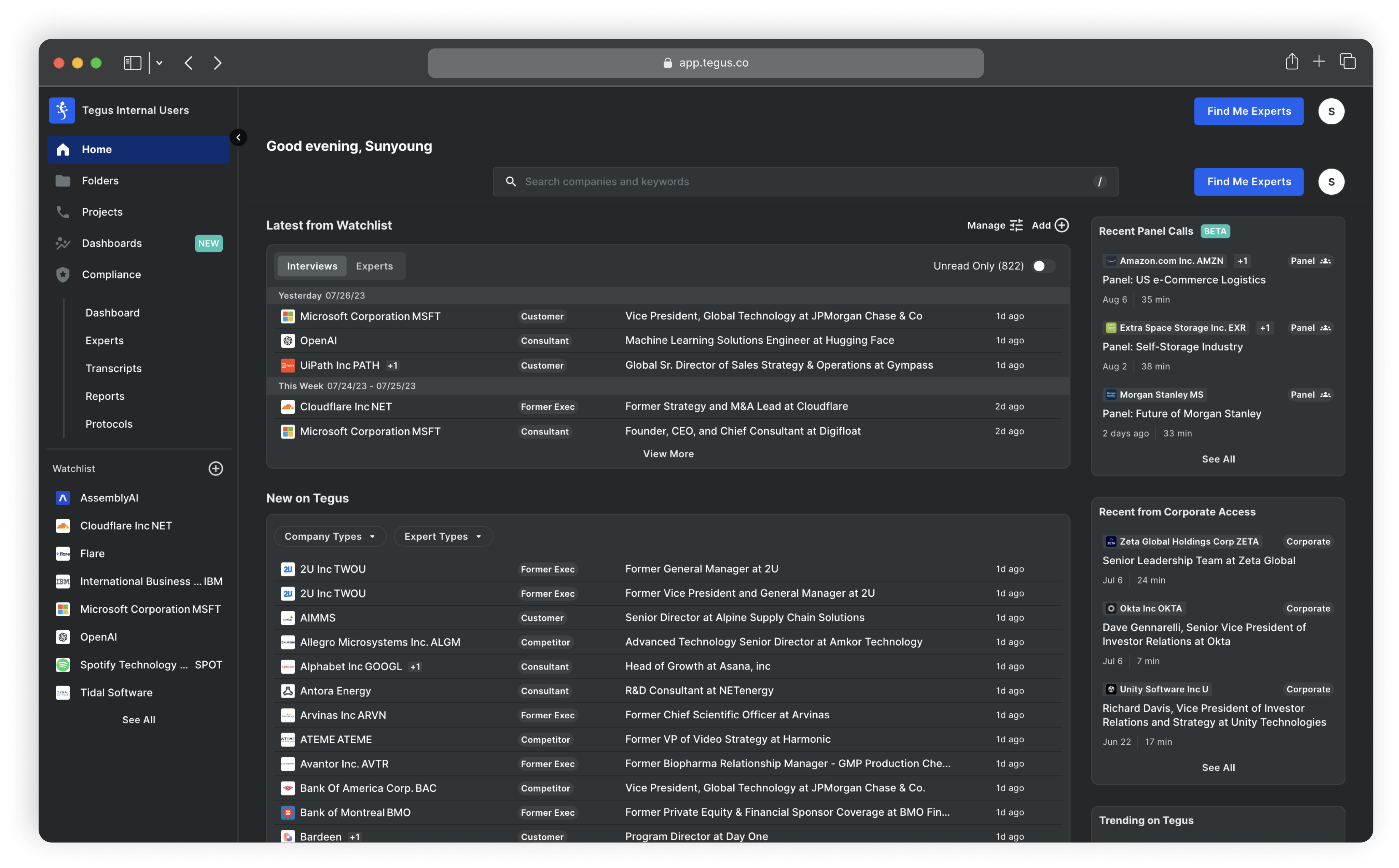
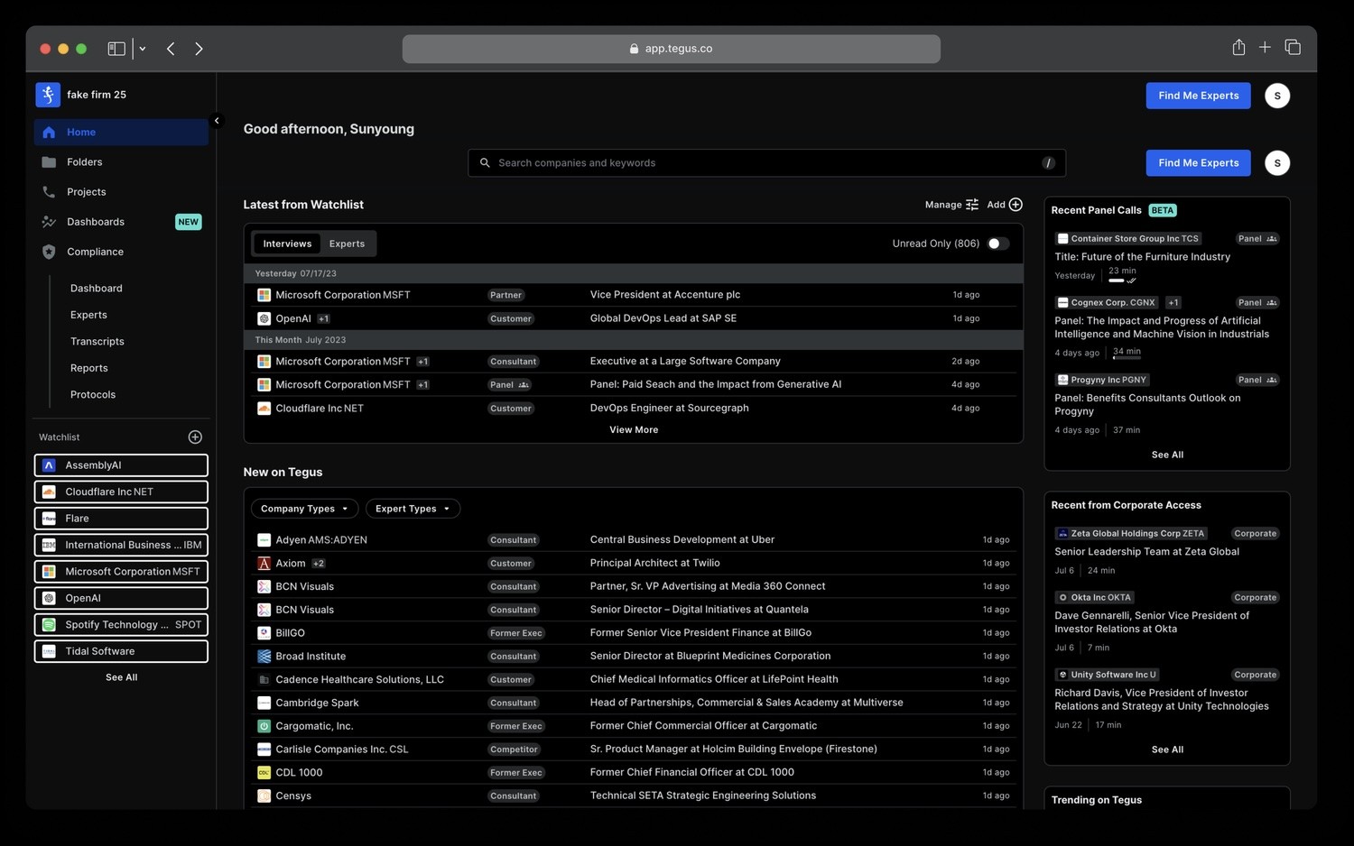
Tegus introduced dark mode with a quick fix—simply inverting the color palette. However, the design system wasn’t originally built with dark mode in mind, leading to usability and accessibility issues.
Problem
The current quick-fix Dark Mode theme was not user friendly or visually aesthetic.
Solution
Dark mode theme designed for both usability and style.
Outcome
Achieved a record-high 18% user adoption in the first week post-launch.
Problem
The inverted color palette led to poor accessibility and compromised visual design.
DESIGN CHALLENGE
How might we create a dark mode experience that balances visual comfort, usability, and scalability?
SOLUTION
Scalable dark mode theme designed for both usability and style
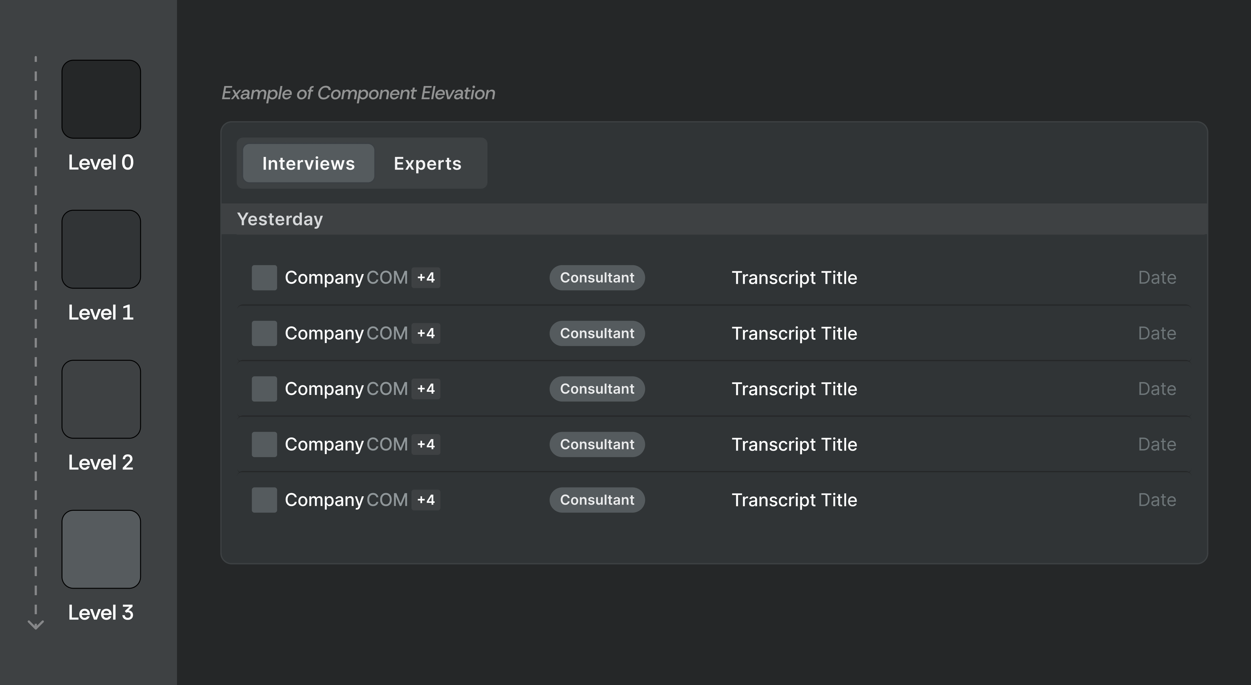
Component Depth and Elevation
Dark mode poses challenges in conveying component depth and elevation since shadows are less effective. To address this, I created a system where components at higher elevations progressively use lighter colors, ensuring clear visual distinctions.
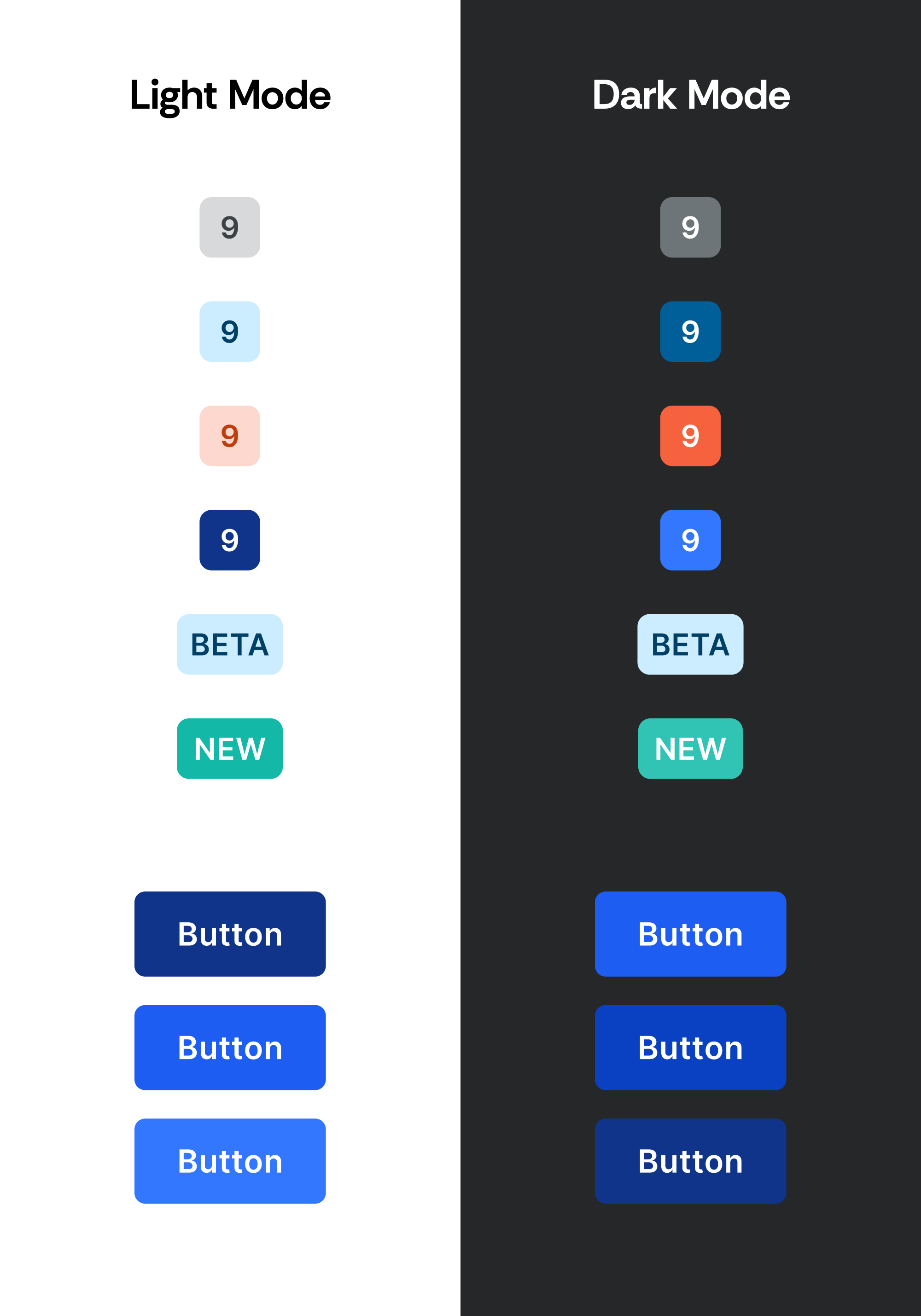
Accent Colors Optimized for Usability and Style
To ensure dark mode feels cohesive without compromising usability, I redefined the accent color palette with higher contrast ratios and more consistent saturation levels.
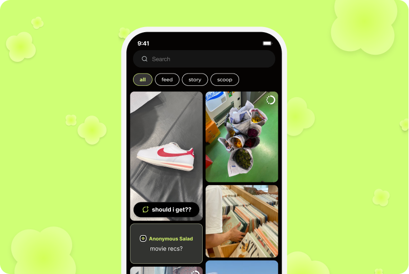
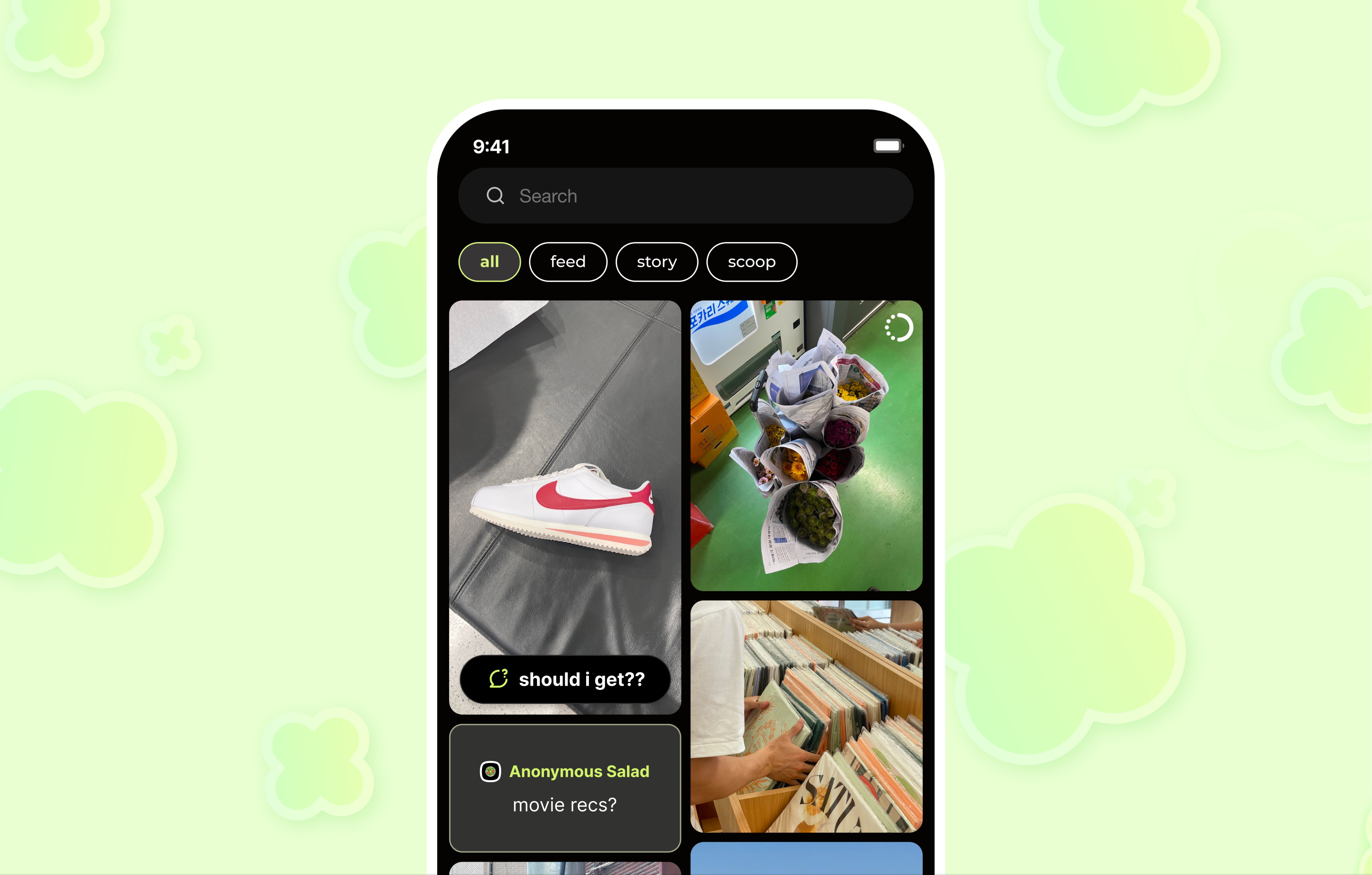
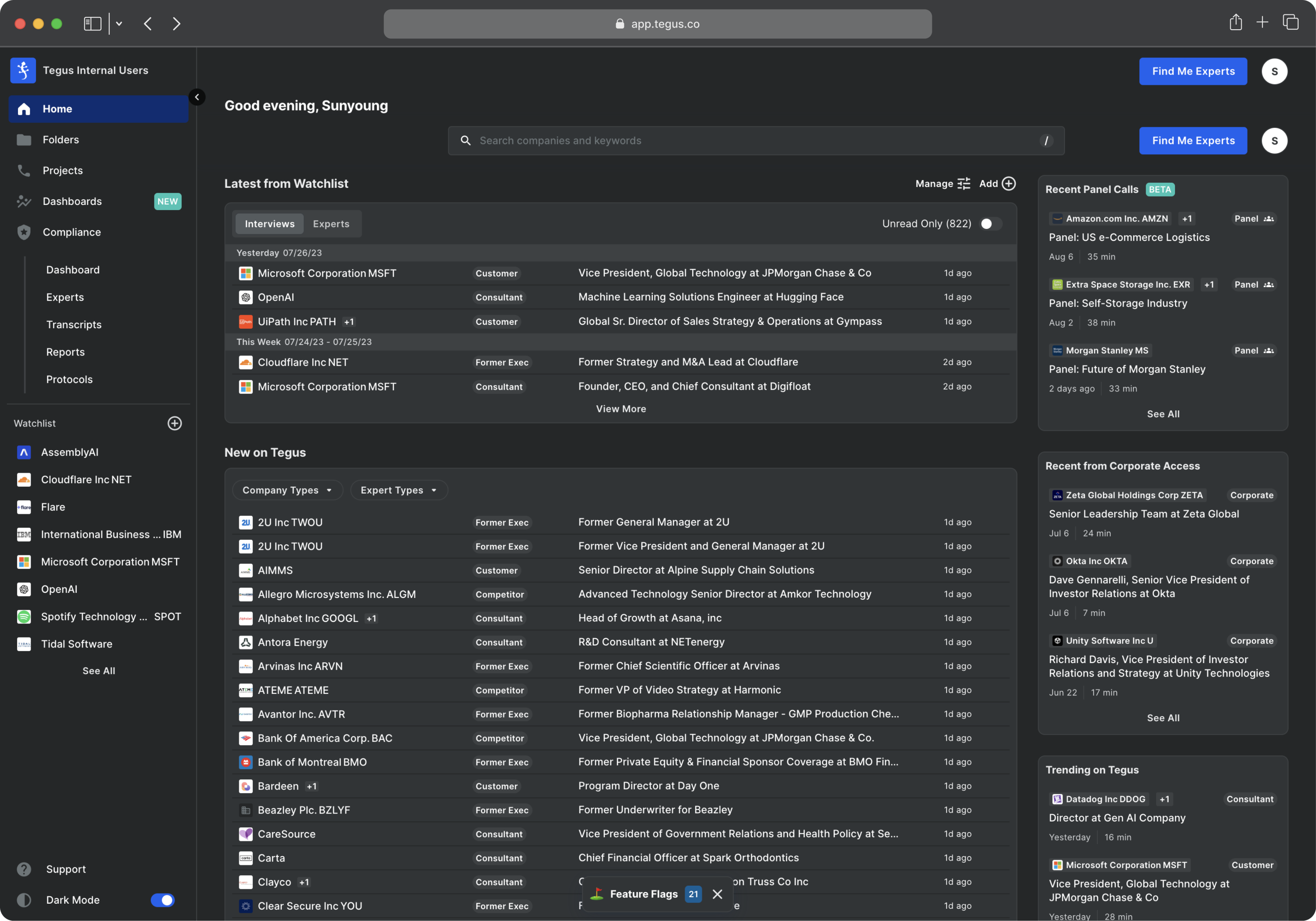
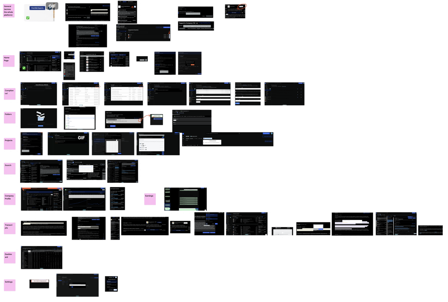
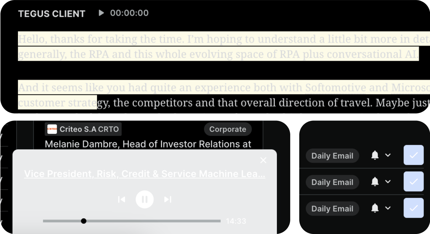
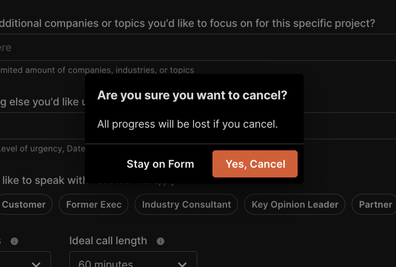
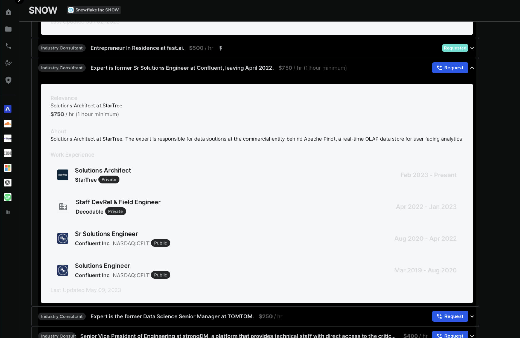
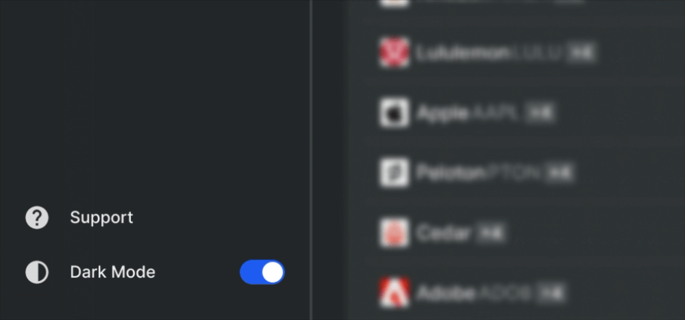
Live Screenshots
Design Process
Design Audit
Where were the gaps in our initial dark mode implementation?
Our initial approach to dark mode was to invert the color scale from our design system. However, incomplete component coverage across the platform led to inconsistent visuals and functionality.
To understand where these issues came from and how to move forward, I conducted a design audit to identify gaps and evaluate which components needed to be rebuilt or refined for a more consistent dark mode design system.
The audit uncovered several key issues with our quick-fix dark mode implementation.
PROBLEM #1
Poor Contrast
The inverted color palette led to insufficient contrast, resulting in inaccessible designs.
PROBLEM #2
Lack of Depth
The absence of shadows and elevation made it difficult to perceive hierarchy and distinguish between layered elements.
PROBLEM #3
Outdated Components
Applying dark mode revealed underlying inconsistencies across the platform, including outdated components that had gone unnoticed in light mode.
Understanding Technicalities
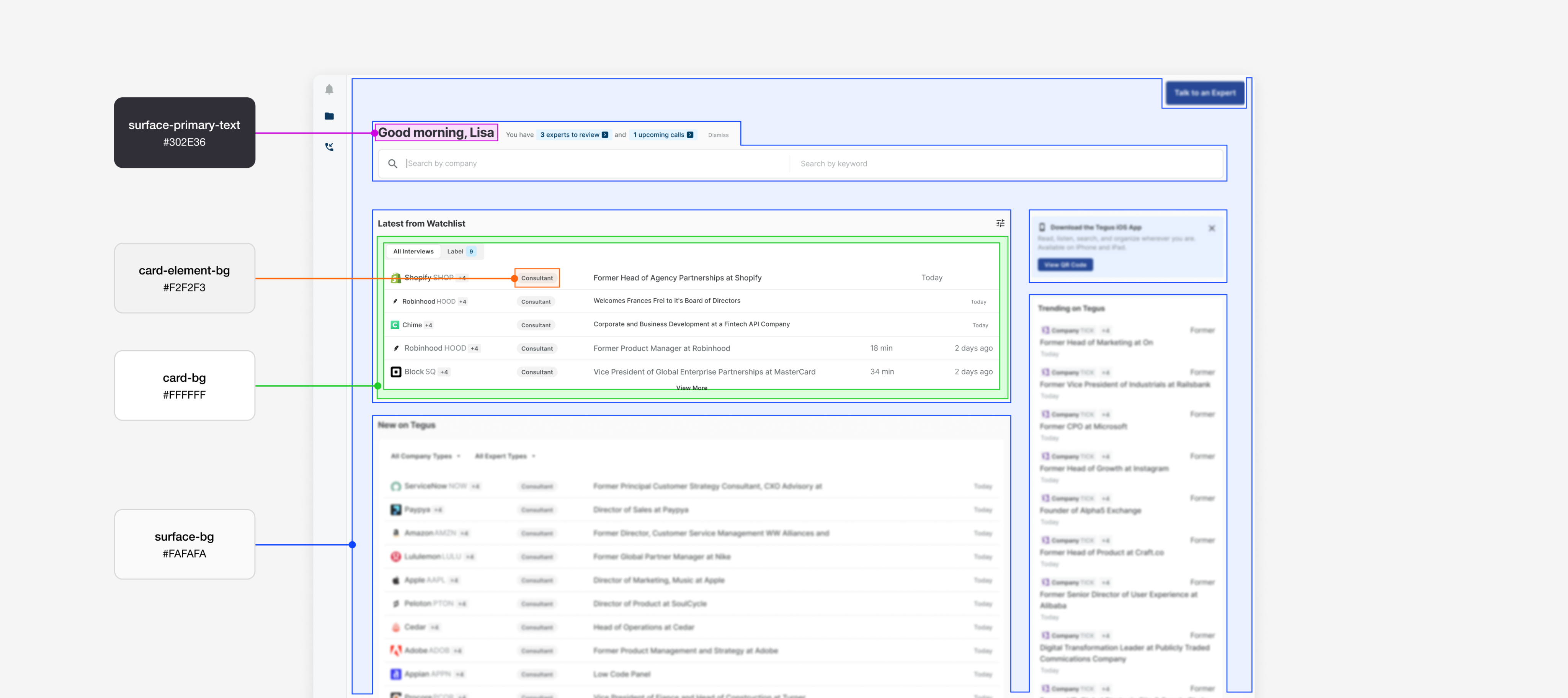
Same color styles, new values.
Components used named color styles like “surface-primary-text” and “card-element-bg.” To implement dark mode, my task was to update the color values tied to each style, while keeping the style names consistent.
Updating the Color Palette
Making design choices grounded in my priorities.
PRIORITY #1
Accessibility
Ensure legibility, contrast, and clear visual hierarchy.
PRIORITY #2
Visual Design
Ensure visually pleasing aesthetics through UI design.
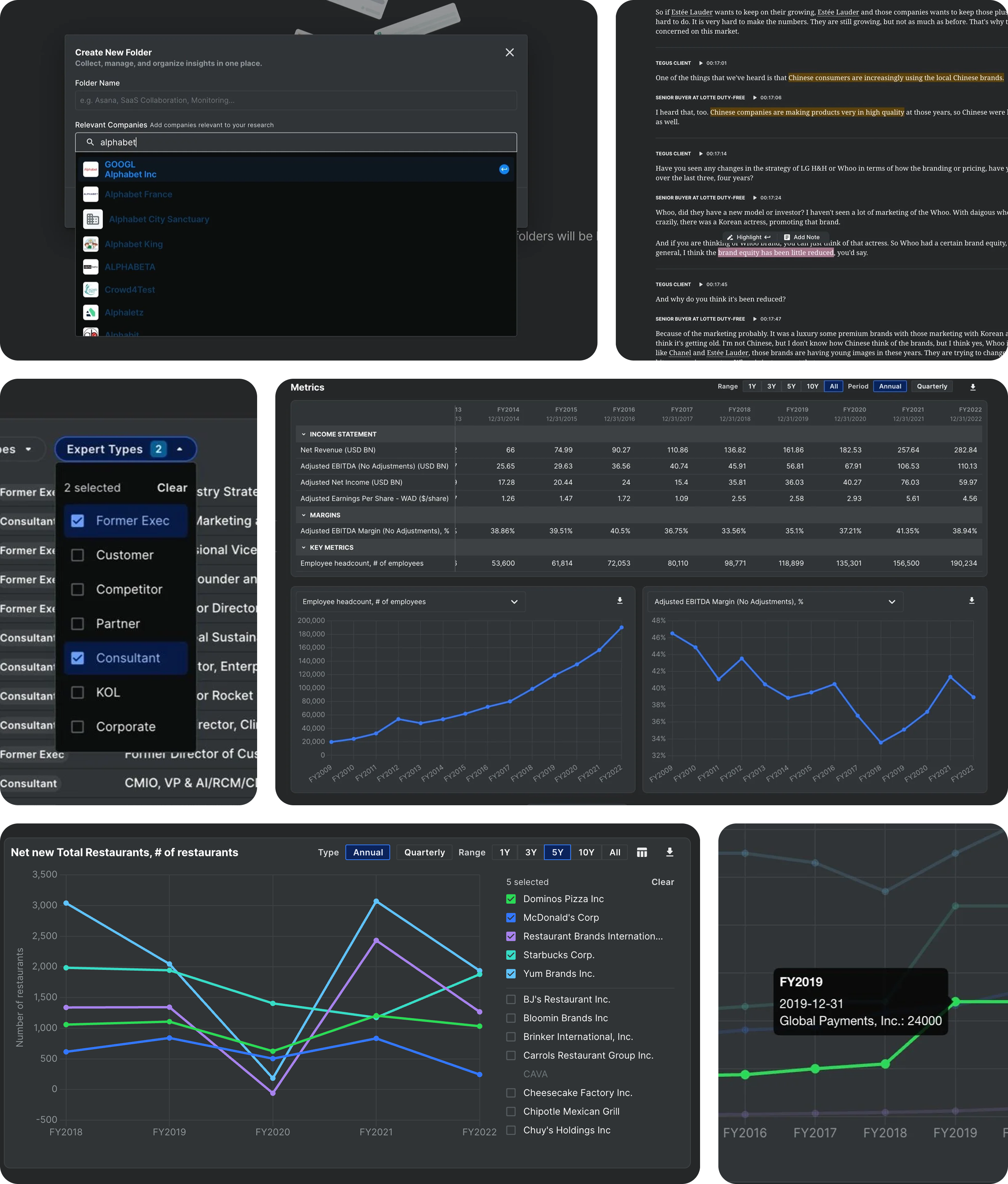
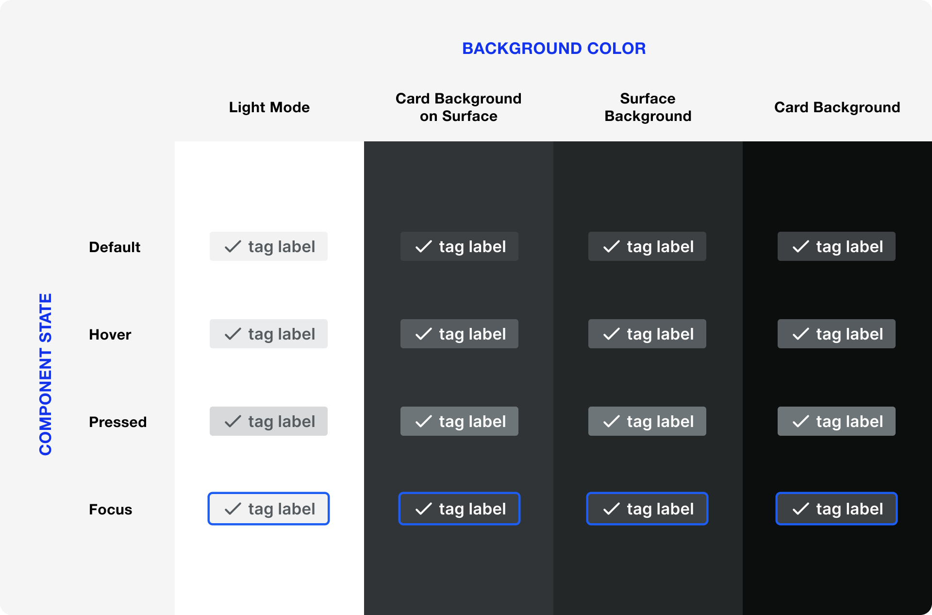
Placing each component individually against various potential dark mode background colors allowed me to visualize their appearance in different use cases.
Updated Color System
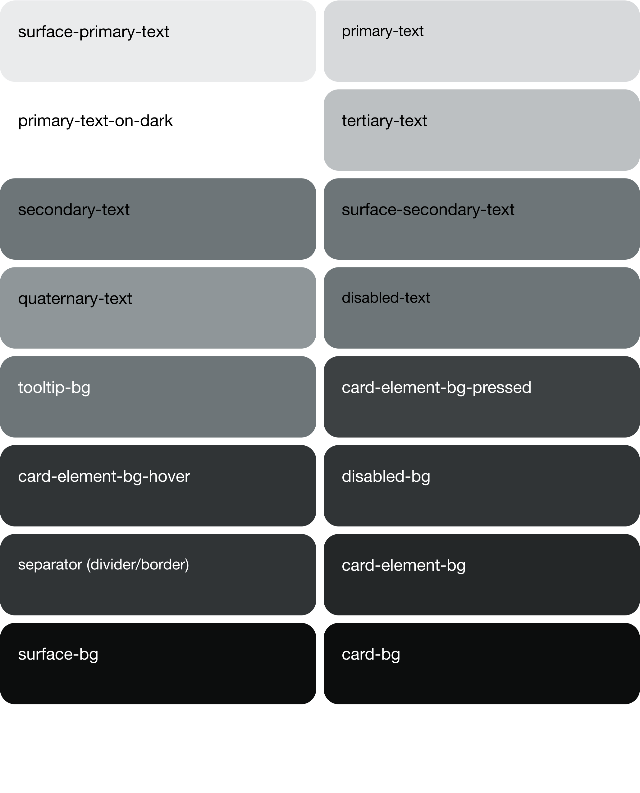
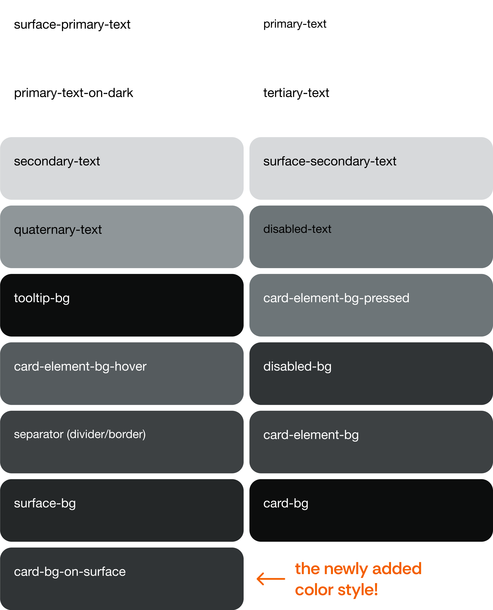
Introducing a new color style.
To ensure scalability in the future and avoid complicating code with exceptions, I've added a new color style to both light and dark mode palettes.
BEFORE
AFTER
Toggle Button Design
With the dark mode color theme created, I now needed to design a toggle button for users to switch between light mode and dark mode.
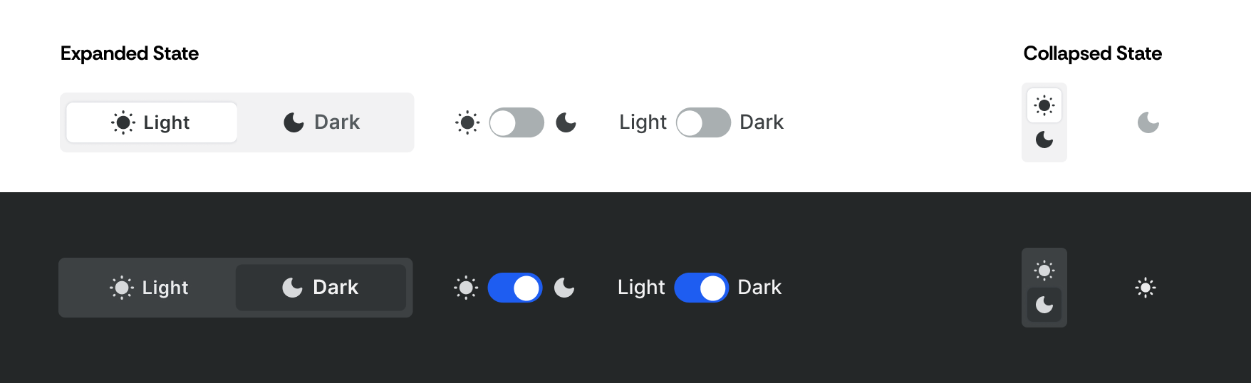
Final Button Design
Reflection
What I Learned
Effectively collaborating with engineers
Close collaboration with engineers taught me technical skills and communication terminology. The technical challenges pushed me to understand of the development-design relationship and potential constraints.
Navigating design systems
This project honed my technical skills in design systems, navigating their complexities. I tackled challenges in matching a chosen color palette across different components, teaching me the complexities of design systems.

Next Project
seerealbox
Revamped the Explore Tab to streamline content discovery

Tegus: Dark Mode
Designed a dark mode theme with scalable design systems
TIMELINE
July 2023
TEAM
2 Product Designers
3 Engineers
DISCIPLINE
Product Design
Visual Design
Design Systems
TOOLS
Figma
ROLE
As a Product Design Intern at Tegus, I collaborated with another intern to guide this project from concept to handoff while overseeing its development.
WHAT IS TEGUS?
Tegus is a research platform that provides investors with insights through expert interviews and transcripts.
Overview
Context
Tegus introduced dark mode with a quick fix—simply inverting the color palette. However, the design system wasn’t originally built with dark mode in mind, leading to usability and accessibility issues.
Problem
The current quick-fix Dark Mode theme was not user friendly or visually aesthetic.
Solution
Dark mode theme designed for both usability and style.
Outcome
Achieved a record-high 18% user adoption in the first week post-launch.
Problem
The inverted color palette led to poor accessibility and compromised visual design.
DESIGN CHALLENGE
How might we create a dark mode experience that balances visual comfort, usability, and scalability?
SOLUTION
Scalable dark mode theme designed for both usability and style
Component Depth and Elevation
Dark mode poses challenges in conveying component depth and elevation since shadows are less effective. To address this, I created a system where components at higher elevations progressively use lighter colors, ensuring clear visual distinctions.
Accent Colors Optimized for Usability and Style
To ensure dark mode feels cohesive without compromising usability, I redefined the accent color palette with higher contrast ratios and more consistent saturation levels.
Live Screenshots
Design Process
Design Audit
Where were the gaps in our initial dark mode implementation?
Our initial approach to dark mode was to invert the color scale from our design system. However, incomplete component coverage across the platform led to inconsistent visuals and functionality.
To understand where these issues came from and how to move forward, I conducted a design audit to identify gaps and evaluate which components needed to be rebuilt or refined for a more consistent dark mode design system.
The audit uncovered several key issues with our quick-fix dark mode implementation.
PROBLEM #1
Poor Contrast
The inverted color palette led to insufficient contrast, resulting in inaccessible designs.
PROBLEM #2
Lack of Depth
The absence of shadows and elevation made it difficult to perceive hierarchy and distinguish between layered elements.
PROBLEM #3
Outdated Components
Applying dark mode revealed underlying inconsistencies across the platform, including outdated components that had gone unnoticed in light mode.
Understanding Technicalities
Same color styles, new values.
Components used named color styles like “surface-primary-text” and “card-element-bg.” To implement dark mode, my task was to update the color values tied to each style, while keeping the style names consistent.
Updating the Color Palette
Making design choices grounded in my priorities.
PRIORITY #1
Accessibility
Ensure legibility, contrast, and clear visual hierarchy.
PRIORITY #2
Visual Design
Ensure visually pleasing aesthetics through UI design.
Placing each component individually against various potential dark mode background colors allowed me to visualize their appearance in different use cases. This allowed me to craft a color pattern that aligns with both my design priorities and works across all potential surfaces.
Updated Color System
Introducing a new color style.
To ensure scalability in the future and avoid complicating code with exceptions, I've added a new color style to both light and dark mode palettes.
BEFORE
AFTER
Toggle Button Design
With the dark mode color theme created, I now needed to design a toggle button for users to switch between light mode and dark mode.
Final Button Design
Reflection
What I Learned
Effectively collaborating with engineers
Close collaboration with engineers taught me technical skills and communication terminology. The technical challenges pushed me to understand of the development-design relationship and potential constraints.
Navigating design systems
This project honed my technical skills in design systems, navigating their complexities. I tackled challenges in matching a chosen color palette across different components, teaching me the complexities of design systems.
Next Project
seerealbox
Revamped the Explore Tab to streamline content discovery
Tegus
Dark Mode
Designed a dark mode theme with scalable design systems
TIMELINE
July 2023
TEAM
2 Product Designers
3 Engineers
DISCIPLINE
Product Design
Visual Design
Design Systems
TOOLS
Figma
ROLE
As a Product Design Intern at Tegus, I collaborated with another intern to guide this project from concept to handoff while overseeing its development.
WHAT IS TEGUS?
Tegus is a research platform that provides investors with insights through expert interviews and transcripts.
Overview
Context
Tegus introduced dark mode with a quick fix—simply inverting the color palette. However, the design system wasn’t originally built with dark mode in mind, leading to usability and accessibility issues.
Problem
The current quick-fix Dark Mode theme was not user friendly or visually aesthetic.
Solution
Scalable dark mode theme designed for both usability and style.
Outcome
Achieved a record-high 18% user adoption in the first week post-launch.
Problem
The inverted color palette led to poor accessibility and compromised visual design.
DESIGN CHALLENGE
How might we create a dark mode experience that balances visual comfort, usability, and scalability?
SOLUTION
Scalable dark mode theme designed for both usability and style
Component Depth and Elevation
Dark mode poses challenges in conveying component depth and elevation since shadows are less effective. To address this, I created a system where components at higher elevations progressively use lighter colors, ensuring clear visual distinctions.
Accent Colors Optimized for Usability and Style
To ensure dark mode feels cohesive without compromising usability, I redefined the accent color palette with higher contrast ratios and more consistent saturation levels.
Live Screenshots
Design Process
Design Audit
Where were the gaps in our initial dark mode implementation?
Our initial approach to dark mode was to invert the color scale from our design system. However, incomplete component coverage across the platform led to inconsistent visuals and functionality.
To understand where these issues came from and how to move forward, I conducted a design audit to identify gaps and evaluate which components needed to be rebuilt or refined for a more consistent dark mode design system.
The audit uncovered several key issues with our quick-fix dark mode implementation.
PROBLEM #1
Poor Contrast
The inverted color palette led to insufficient contrast, resulting in inaccessible designs.
PROBLEM #2
Lack of Depth
The absence of shadows and elevation made it difficult to perceive hierarchy and distinguish between layered elements.
PROBLEM #3
Outdated Components
Applying dark mode revealed underlying inconsistencies across the platform, including outdated components that had gone unnoticed in light mode.
Understanding Technicalities
Same color styles, new values.
Components used named color styles like “surface-primary-text” and “card-element-bg.” To implement dark mode, my task was to update the color values tied to each style, while keeping the style names consistent.
Updating the Color Palette
Making design choices grounded in my priorities.
PRIORITY #1
Accessibility
Ensure legibility, contrast, and clear visual hierarchy.
PRIORITY #2
Visual Design
Ensure visually pleasing aesthetics through UI design.
Placing each component individually against various potential dark mode background colors allowed me to visualize their appearance in different use cases. This allowed me to craft a color pattern that aligns with both my design priorities and works across all potential surfaces.
Updated Color System
Introducing a new color style.
To ensure scalability in the future and avoid complicating code with exceptions, I've added a new color style to both light and dark mode palettes.
BEFORE
AFTER
Toggle Button Design
With the dark mode color theme created, I now needed to design a toggle button for users to switch between light mode and dark mode.
Final Button Design
Reflection
What I Learned
Effectively collaborating with engineers
Close collaboration with engineers taught me technical skills and communication terminology. The technical challenges pushed me to understand of the development-design relationship and potential constraints.
Navigating design systems
This project honed my technical skills in design systems, navigating their complexities. I tackled challenges in matching a chosen color palette across different components, teaching me the complexities of design systems.
Next Project
seerealbox
Revamped the Explore Tab tostreamline content discovery